2024/4/22 - 2024/7/26
TAO YUZE/0366967
Typography / Bachelor fo Design (Honours) in Creative Media
Lecture
Axial System
The axis type can be said to be the simplest system. It is to arrange all the elements along a single axis to the left or right. The axis can be placed anywhere in the layout to make a symmetrical or asymmetric composition.
Radial System
In the radiation system, all elements start from one center focus, extending out like light. Because radiation lines can form a circle, the visual effect is quite good. The composition often matches the text in a single or more circle. This will generate asymmetric, although not perfect, it can trigger more visual interests.
Dilatational System
The ripple -type system will have a round heart that spreads multiple circles from the heart. Both ripple -type systems and radiation systems have the characteristics of dynamic composition. The viewer's sight will move along the circular arc, or it is attracted to the focus of the center.
Random System
When the designer arranges the elements of the random system, it does not adopt clear goals and modes. Some elements will not be aligned, which will make people mistakenly think that it is a composition that deliberately arranges. However, if the text is used to place the text from cutting, overlapping, overlapping, and from a weird angle, the effect will be better when it is easy to disappear.
Grid System
The network format system arranges the relationship between the element with vertical and horizontal distribution. The network format system is usually more formal and restrained, with the purpose of establishing visual order. This system is more common in publications and web design, which can guide information levels and promote visual levels.
Transitional System
The travel system is pushed and flipped unrestrainedly. The elements in this composition can be moved at will. The marching composition can be loose and wide in the space, and it can also be emphasized in a close arrangement. The most difficult part of the travel system is how to make each element have a relationship without alignment. In fact, let the semi -annual elements gather texture and shape the texture, which is a good way to alternate alignment.
Modular System
The modular system is to accommodate the standardized abstract element or unit as the background to accommodate the text. During the composition process, the designer assigned the organization to the modular unit and arranged on the layout. The module system is placed on the module unit, and then this unit compositions to convey the message.
Bilateral System
In the visual organization system, the most symmetrical is bilateral symmetry. This system is placed on the layout, and the text column is centered on axis, and symmetrically arranges on the left and right sides. The symmetrical composition on both sides is prone to the disadvantages of old -fashioned boring, but we can remove the axis from the center of the page or the axis recipe.
Instructions
According to MIB requirements, I need to create eight typography designs based on eight design systems
Axial System
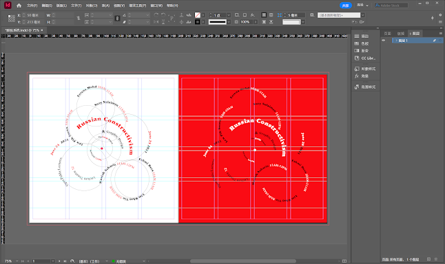
I chose Russian Constructivism and Graphic Design as my title and theme. After understanding the content of the article, I decided to use the ITC series fonts, because the ITC fonts were inspired by the famous Russian designers Georgii Stenberg and Vladimir Stenberg. In order to pay tribute to the theme So I chose it.Color matching I can only choose one additional color, I choose red.
When I create, I use the Pen Tool to create a line and then explore based on that line. I explored four different options
 |
| Axial system 2024/4/29 |
 |
| Axial system 2024/4/29 |
When creating, I tried to highlight the title part. The word "Constructivism" is long, so I placed it parallel to the axis.I personally prefer the richness brought by multiple reading directions.
Radial System
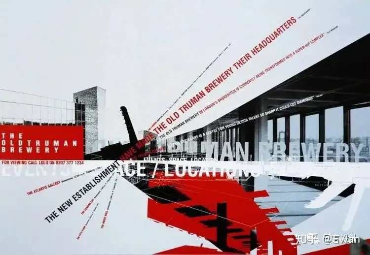
When I was exploring the Radial System, I was inspired by the poster of the Old Truman Winery. The poster used a radial system and wanted to convey that the factory had transformed into a "center for young design talents" after renovation. The text is arranged around a central visual focus with strong horizontal lines, while sharply angled text cuts through the collage. The radiating composition conveys the concept of the poster very well: the building is the core of the burst of energy.
I extracted two main points, a single letter as the pivot point and an explosive style
.jpg) |
| Radial System 2024/4/29 |
I created two different alternatives and based on mr vinod's feedback I will go with the second one as the final option
Dilatational System
 |
| Dilatational System 2024/4/29 |
When exploring the expansion system I mimicked the shape of the solar system, arranging circles of varying sizes around a core. Then use the path text tool for typesetting.Finally, I confirmed a stable arrangement, and I kept the two color versions for comparison.
Based on mr vinod's feedback, I chose the version with a red background and modified the angle of some of the text to increase fluidity
.jpg) |
| Dilatational System 2024/4/29 |
Random System
 |
| Random System 2024/4/29 |
The random system gives me a higher degree of freedom. I think simply placing them randomly is not vivid enough. I simulated what it would look like if the templates were dropped from a height and stacked. At the same time, the text is classified according to its importance to ensure readability and reading order.
I created two versions, dark and light, using two different ideas. In the light version, in order to increase entropy without affecting readability, I used low-contrast white text as the background. Although I can't use the fourth color in the requirements, I saw someone using it in the example blog, and it worked very well. (Or is this considered a derivative of gray?)
Grid System
 |
| Grid System 2024/4/29 |
 |
| Grid System 2024/4/2 |
The grid system is a pragmatic system that is very efficient in transmitting information, but lacks vitality.In the case of large amounts of text, the grid system can work well to its advantage. In this exercise I was given less text and I needed to add a few extra things to spruce it up
I added some visible lines and boxes along the grid to spice up the visuals,I'm happy with both versions, I chose the lighter version as my final choice because it reminded me of the box tape cover.
Transitional System
 |
| Transitional System 2024/4/29 |
In the exploration of Transitional System, I once again used light-colored fonts as the background. It is a bit difficult to make connections between floating fonts, especially the text of and graphic design, which is easy to break away. After some more trial and error I decided to make the ampersand red, which would again capture the viewer's attention and allow the reading sequence to continue.
Modular System
 |
| Modular System 2024/4/29 |
 |
| Modular System 2024/4/29 |
The module system was the most interesting part of this exercise, and the Russian and constructivism reminded me of Tetris. I decided to use Tetris as one of my references. At the same time, the color scheme of the avant-garde posters shown in the article also affected me. The strong contrast between black and red burns the eyes of the observer, and it engraves the message in the eyes of anyone who sees it.
I created two completely different versions. In the first version, I used three squares of different sizes as modules to arrange, making full use of the limited three colors. Maximize color contrast according to the contrast principle
The second version I took an idea that I had never done before, I made the module fill the entire page space. Like Tetris or the periodic table. In order to make some words better distributed in the module, I adjusted some words. However, the strong color contrast eliminates the sense of dissonance and fragmentation caused by the enlarged character spacing.
Bilateral System
The Bilateral System is also recognized as one of the traditional typesetting systems. If the typesetting is done in a regular and symmetrical way, it will lack vividness. I tried to stagger the text on either side like a fault caused by an earthquake. At the same time, I also added geometric elements like a grid system, and I made the axis of symmetry visible to enrich the visual effect. The & symbol aligns with the axis of symmetry, it looks like a red bow tie
 |
| Bilateral System 2024/4/29 |
Final Outcome
Exercise 2
According to the requirements, we need to use an image that meets the requirements, use our subjective initiative to find an image that matches the shape of the letters, and process it into a new font.
According to Mr Vinod's request, the image must be composed of a relatively single material. It just so happens that I captured some similar images that I will be creating with
 |
| Dusk by TAO YUZE 2024/5/2 |
The photo I took contains a lot of silhouettes of tree branches, perfect for alphabet searches.
%20%202024_5_1%2019_13_45.png) |
| alphabet search 2024/5/2 |
I chose the four letters DUSK as my theme
 |
| alphabet process 2024/5/2 |
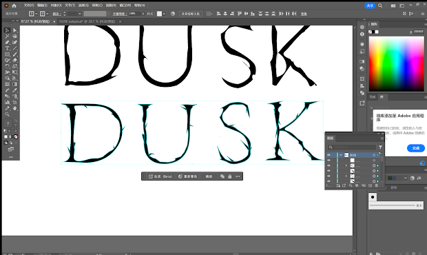
First I used AI to copy the shapes, align them and adjust the angles,I then used Gill sans as my reference font, I placed the shapes on top of the Gill sans and stretched them until the height and width fit.
At this point the shapes are highly readable, but they have lost the style of the branch shape. I want them to be like silhouettes of branches
%20%202024_5_2%2015_01_43.png) |
| Processing 2024/5/2 |
In order to emphasize the style of the branches, I started to play with the shapes subjectively, first I made them thinner and rougher. I implement it by moving the path nodes.
Then I borrowed some fonts like ITC std and added sharp ends.The purpose is to add a sharp, branch-like feel. Finally I added additional branch like shapes
Final effect demonstration (pictures are all taken by me)
 |
| DUSK poster 1 2024/5/2 |
 |
| DUSK poster 2 2024/5/2 |
%202024_5_2%2015_15_16.png) |
| process 2024/5/2 |
%202024_5_2%2015_14_43.png) |
| process 2024/5/2 |
FINAL PDF (Before Feedback)
Final Outcome After Feedback
According to Mr Vinod's feedback, I need to widen the left part of the font appropriately. At the same time, Mr Vinod thought that my reference font was not close enough to my font because I changed the shape too much, so I changed the reference font to a closer Adobe Song std
 |
| After Feedback 2024/5/8 |
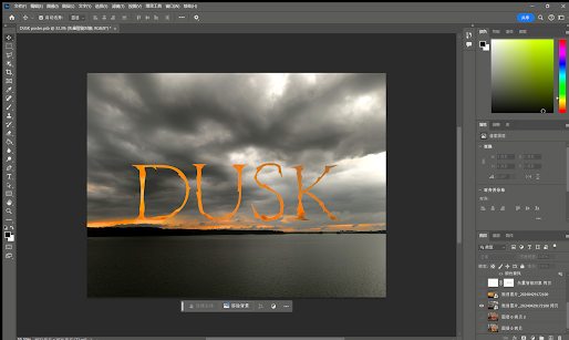
Based on Mr Vinod's feedback, I made more improvements to my poster. First I changed the font to the post-feedback version, then I added a glow effect and a depth effect to make the title blend more into the background. Finally, the subtext and logo of the poster were added according to Mr Vinod's request, and the size was changed to 1024X1024 |
| Final Poster Outcome 2024/5/8 |
FINAL PDF (After Feedback)
Feedback
Week 2
General Feedback
There were no major problems overall, and the final choice was determined based on feedback
Specific Feedback
The stepping system increases white space
Week 3
General Feedback
The poster was made prematurely, and the reference font needed to be replaced
Specific Feedback
The left side of the font needs to be widened to add depth to the poster based on feedback
Week4
General Feedback
Final Submission
Specific Feedback
find better logos for poster
Week 5
General Feedback
More exploration is needed in font design
Specific Feedback
The font is not readable enough and the alphabetical order is complicated.
Week 6:
General Feedback: There is no problem with the overall core design
Specific Feedback: But there is a problem with the readability of the font, and cue lines have been added to enhance readability
Week 7
General Feedback: Try to prevent using trends as it lacks originality.
Specific Feedback: Using the same element too much can make the letterforms less impactful.
Reflection
Experience
Initially, I found the concept of typographical systems quite unfamiliar, which made the first exercise particularly challenging and time-consuming. I aimed to present multiple ideas for each of the eight systems, resulting in 16 different designs. While I aspired to be experimental, I struggled to remain within the confines of the systems. However, the second task proved to be more enjoyable and engaging, especially during the extraction process from our reference picture. It took several attempts before I was satisfied with the final product, primarily due to the initial reference picture I used. These experiences underscored the critical role of inspiration and references in achieving desired outcomes, particularly for this task. Additionally, I improved my efficiency with Adobe Illustrator, becoming more familiar with creating typefaces from images under time constraints.
Observations
In typographic design, balance is crucial across various aspects, especially within typographic systems. There needs to be a harmony between following established conventions and being experimental enough to keep the designs intriguing while maintaining readability (function). Numerous small elements can significantly impact the overall composition, necessitating designers to be consistently mindful in their creations.
Findings
Typography contains numerous unwritten rules, as evident in the systems. While there is freedom in arrangement, there are certain guidelines that define a 'good' composition. In the second task, I discovered that design inspiration is omnipresent in our lives, from man-made objects to natural elements. It was fascinating and enjoyable to create typefaces by extracting elements from pictures, provided there is sufficient creativity.
Further Reading
Stop Stealing Sheep & Find Out How Type Works
Author: Erik Spiekermann
Link: Amazon
Erik Spiekermann's Stop Stealing Sheep & Find Out How Type Works is a classic introductory book on typography. Written in a light-hearted and humorous style, it explains the fundamentals of type and typography. The title, derived from a German saying, symbolizes the idea of understanding and mastering typography rather than copying others' designs. Spiekermann uses engaging language and numerous illustrations to show how to choose and use typefaces effectively, making text both readable and visually appealing. This book is an invaluable resource for both beginners and professional designers.
Chapter 1: Type Is Everywhere
In this chapter, Spiekermann introduces the omnipresence of type and its importance. He emphasizes how typefaces are integral to daily life, from road signs to packaging, newspapers to digital screens. Through numerous everyday examples, he illustrates the significant impact of type choices on communication and visual appeal. The chapter also provides a brief historical background on typography, helping readers understand the evolution of type.
Chapter 2: What Is Type?
This chapter delves into the basic components and classifications of type. Spiekermann explains different styles and types of fonts, including serif, sans-serif, and script fonts. He details the structural elements of type, such as x-height, kerning, and leading, to help readers build a foundational understanding of typography. The chapter also includes historical anecdotes about various typefaces, enhancing the reader's appreciation for each font's uniqueness and application.
Chapter 3: Type with a Purpose
In the third chapter, Spiekermann discusses strategies and techniques for choosing typefaces. He emphasizes the suitability of different fonts for various contexts and provides practical advice to help readers make informed type choices in their design projects. The chapter also introduces the art of font pairing, demonstrating how thoughtful combinations of typefaces can enhance design hierarchy and visual interest.
Chapter 4: How Type Works
This chapter offers a detailed explanation of the technical aspects and practical applications of type. Spiekermann explores the differences in font performance between print and digital media, covering font file formats, resolution, and rendering techniques. He also explains how to optimize text readability and aesthetics by adjusting parameters like kerning and leading. This chapter is more technical but very useful for readers who want to delve deeper into the mechanics of typography.

.jpg)


.jpg)


.jpg)

.jpg)


%20%202024_5_1%2019_13_45.png)

%20%202024_5_2%2015_01_43.png)


%202024_5_2%2015_15_16.png)
%202024_5_2%2015_14_43.png)
-%E5%9B%BE%E7%89%87-0.jpg)
-%E5%9B%BE%E7%89%87-1.jpg)
-%E5%9B%BE%E7%89%87-2.jpg)
-%E5%9B%BE%E7%89%87-3.jpg)
-%E5%9B%BE%E7%89%87-4.jpg)


评论
发表评论